
New 2020 Colour Trends
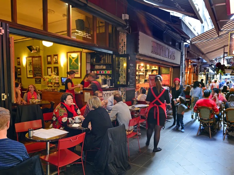
An international meeting place for professionals in lifestyle, interior decoration and design, the Maison and Objet trade fair brings together nearly 3,000 brands and 90,000 visitors twice a year. Houzz’s editorial staff was on the scene to scout out the latest trends in furniture, materials, patterns and colours.
Two palettes stood out clearly at this year’s January 2020 edition of the show: a range of light colours that includes neutral tones, vegetable greens, sky blues and tender pinks; and a set of dark hues including terracotta, burgundy and deep blues.
1. Natural shades
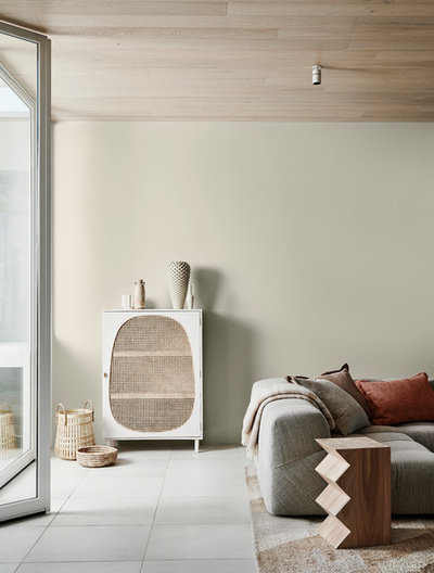
Neutral tones are no longer there just to play up more daring colours: they now take the starring role in decorative palettes. This year we’ll use them on walls and furniture, energising the final result with darker accessories or small furniture.
Beiges are therefore in the spotlight, and are part of the natural palette that’s becoming more and more popular in interiors.
“When it comes to decoration, Generations Y and X especially favour terracotta and nude colours. Anything linked to the earth could not be trendier,” says trend hunter Vincent Grégoire, whose analysis was the basis for the theme of this edition of Maison et Objet: (Re) Generation!
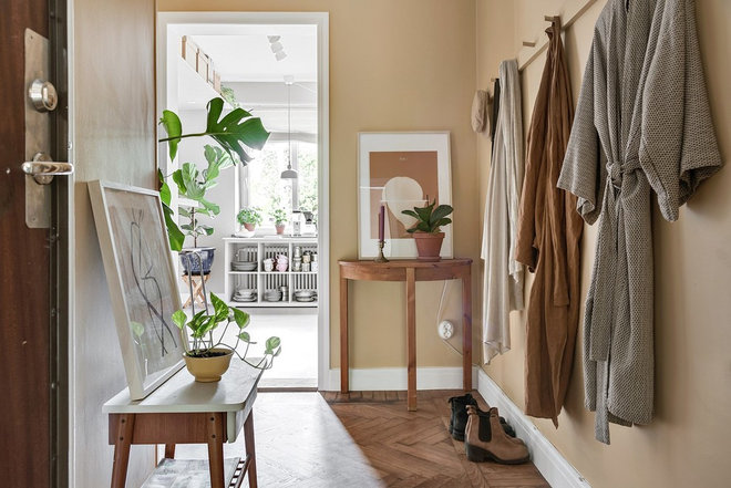
2. From sand to vanilla
Still within the neutral spectrum, other colours such as sand, vanilla, straw and at times washed-out, toned-down yellows have become more popular. They add a soft warmth to interiors. Like other neutrals, they are currently appreciated for their relaxing and soothing properties, meeting the needs of a busy society in search of nature.
Combined with sage green or muted vegetal hues, these shades can warm up a cold palette without being too aggressive or taking away from a soft overall effect.
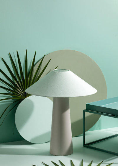
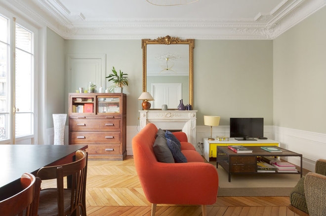
3. Tender greens
Greens are experiencing an upsurge in popularity. Paint manufacturers agree, and have been developing their own green shades in a kind of ode to nature.
Dulux was one of the first, naming the pale-green Tranquil Dawn the 2020 Colour of the Year. This shade appeared on many of the booths at this month’s fair.
4. From mint green to peacock blue
But we spotted even more varieties of green this year, all with one common denominator: softness. From sage green, we go to mint green for a feeling of freshness.
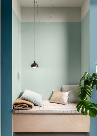
Continuing with greens but adding a touch of blue, the blue-green peacock hue brings with it a certain depth that other colours in this series lack.
5. Delicate sky blue
This year we also spotted a slightly washed-out sky blue, which has been somewhat forgotten until now. It enriches the natural palette with allusions to sky and water, a natural complement to soil and plants.
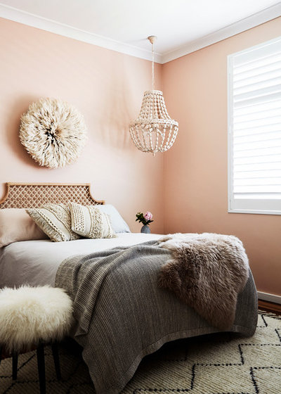
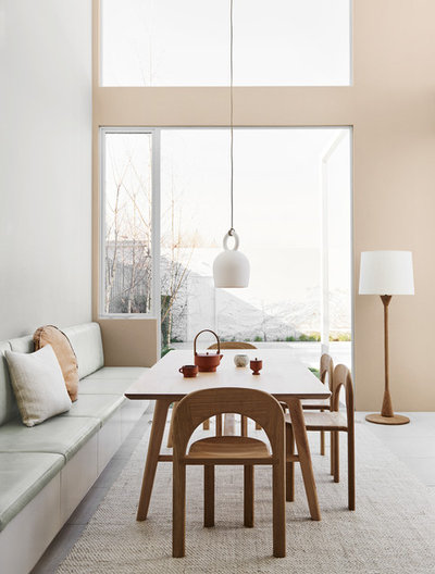
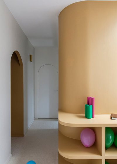
6. Tender pinks
Whether pale, muted, pastel, peach or salmon, pinks will still be very much present in 2020’s interiors. Used in more extensive colour schemes to inspire wellbeing, or alone to bring softness to a combination of warm and/or deep colours, pinks add richness to decor.
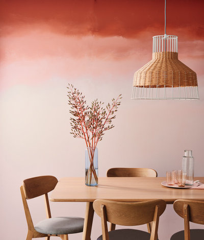
7. Terracotta is still here
Terracotta brings us from light to dark palettes, which we will be seeing a lot of in 2020. Terracotta is nothing new, as it has made a comeback in recent years. It is a symbol of the current craze for earthy colours, pointing to another range of natural shades at the heart of the dark trend as well.
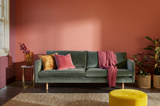
This hue can be used to anchor warm colour compositions. Sometimes it appears contrasted by a cooler shade, as in this image, where the green sofa is highlighted by terracotta, pink and mustard yellow.
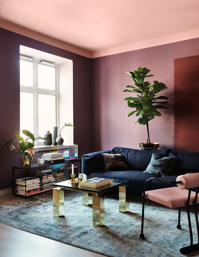
8. Burgundy returns
We also saw reds tinged with blue or indigo as burgundy steps back onto the scene. This shade added nuance to the colour schemes we saw at the fair. It goes well with not only greens and blues but also the whole range of beige and neutral tones.
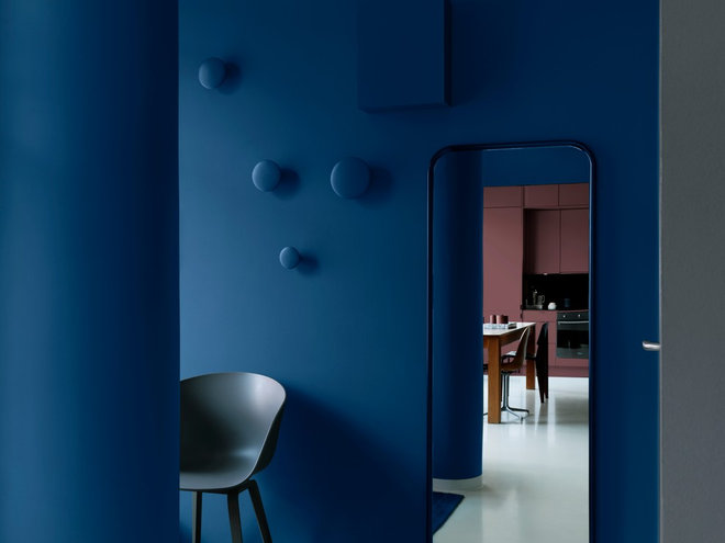
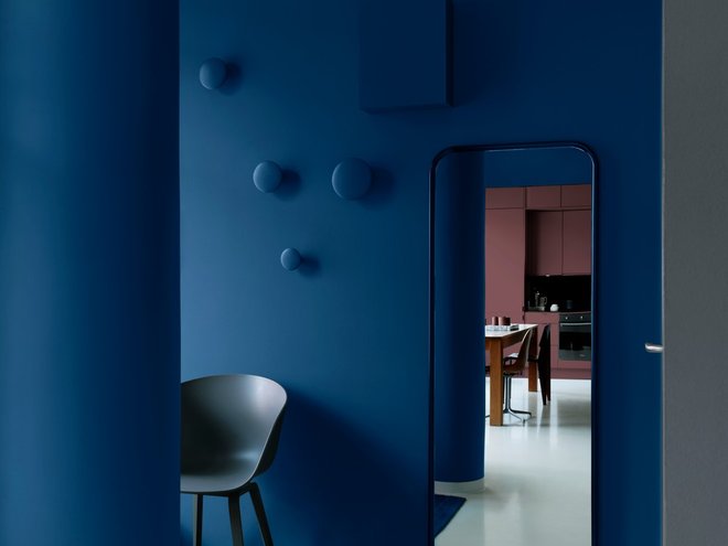
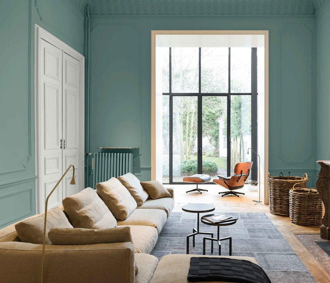
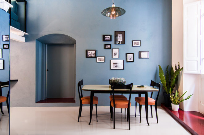
9. Classic blue
Named Colour of the Year 2020 by the Pantone Color Institute last December, Classic Blue was shown combined with many similar colours at this edition of Maison & Objet. It inspires an ambience of calm, confidence and harmony, and mixes easily with this year’s other popular shades, especially burgundy. Leatrice Eiseman, executive director of the Pantone Color Institute, describes it as “a warm presence that evokes the sky at the end of the day, vast and infinite, opening up a world of possibilities”.
10. The marriage of light and dark palettes
Light and dark are two palettes that stood out clearly at the aisles of the fair.
Originally published on Houzz