
How to decorate your home using Pantone’s colours for 2021, Ultimate Grey and Illuminating
Each December, the go-to global colour authority Pantone releases its colour (or colours) of the year. For 2021, The Pantone Colour Institute announced that two shades, Ultimate Grey and Illuminating (a bright yellow), will be the hues that shape our design and fashion choices.
But take heed – there’s no need to toss that khaki bedspread or those dusty pink couch cushions just yet.
“A lot of people will already have a grey sofa or a grey armchair – it’s a good neutral to use – it’s safe, reliable, dependent. But the yellow is a very different story because it’s a colour that can be a little bit polarising,” interior designer and stylist Jono Fleming says.
While various shades of grey have been a mainstay in our homes for a few years now, that luminescent yellow might be bright enough to scare many of us away from incorporating it into our homes – but it doesn’t have to be.
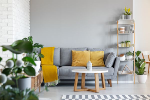
“The bright Illuminating yellow that they’ve [Pantone] chosen is super bright, but it works really well with other colours and works really nicely as an accent,” Fleming says.
“If you have had those Scandi blush pinks that have been popular over the past few years, the yellow pairs really beautifully with that.”
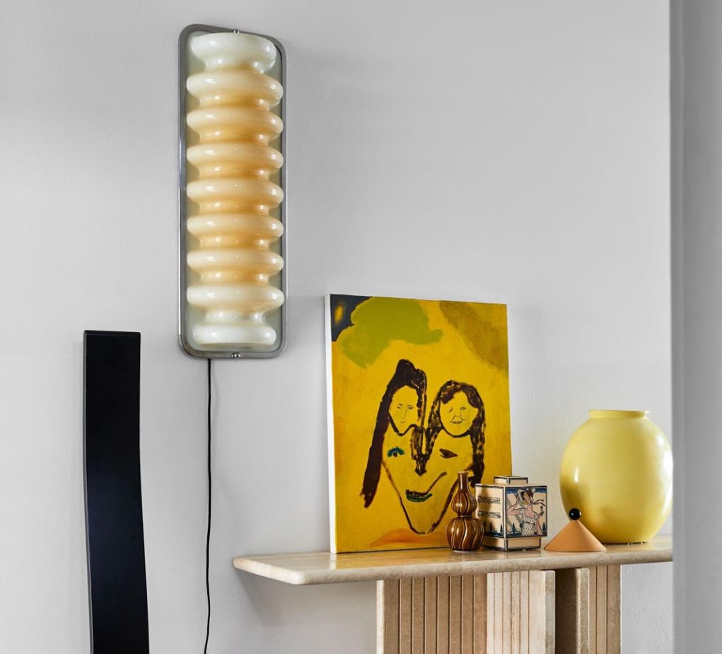
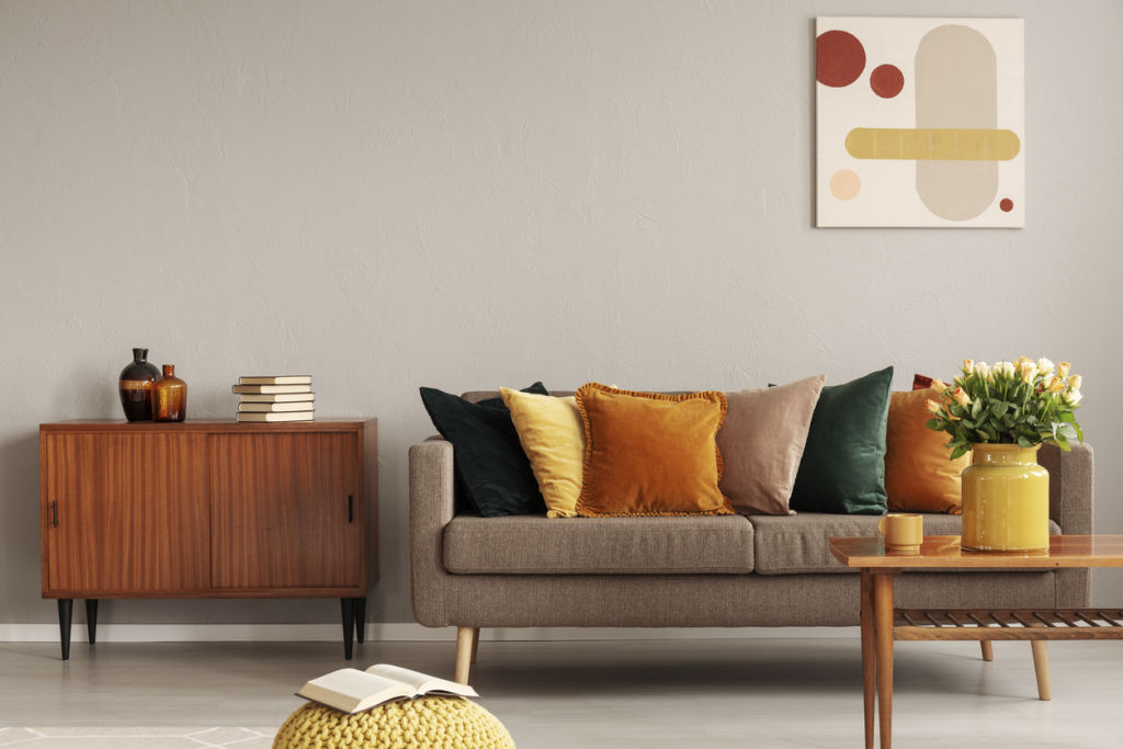
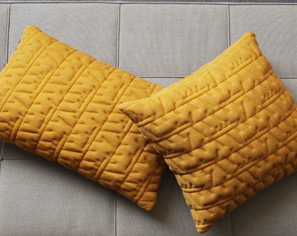
Fleming says the key is to introduce small pops of colour into your space through smaller objects – accent pieces such as art, cushions, throws and rugs are a simple and effective way to inject a bit of personality and brighten a room.
For those of us that aren’t quite ready to embrace the bold, fear not, for we’re likely to soften the hue to reflect our external environment.
“This is a global colour trend but the way that we use colour in Australia is different,” Fleming says. “We’ve seen the emergence of very earthy tones – reds, clay and burnt colours.
“So, much of our inside spaces reflect outside as well. For us, we look at yellow and we think of things like wattle and lemons – it is very Australian fauna-based the way we would use yellow.
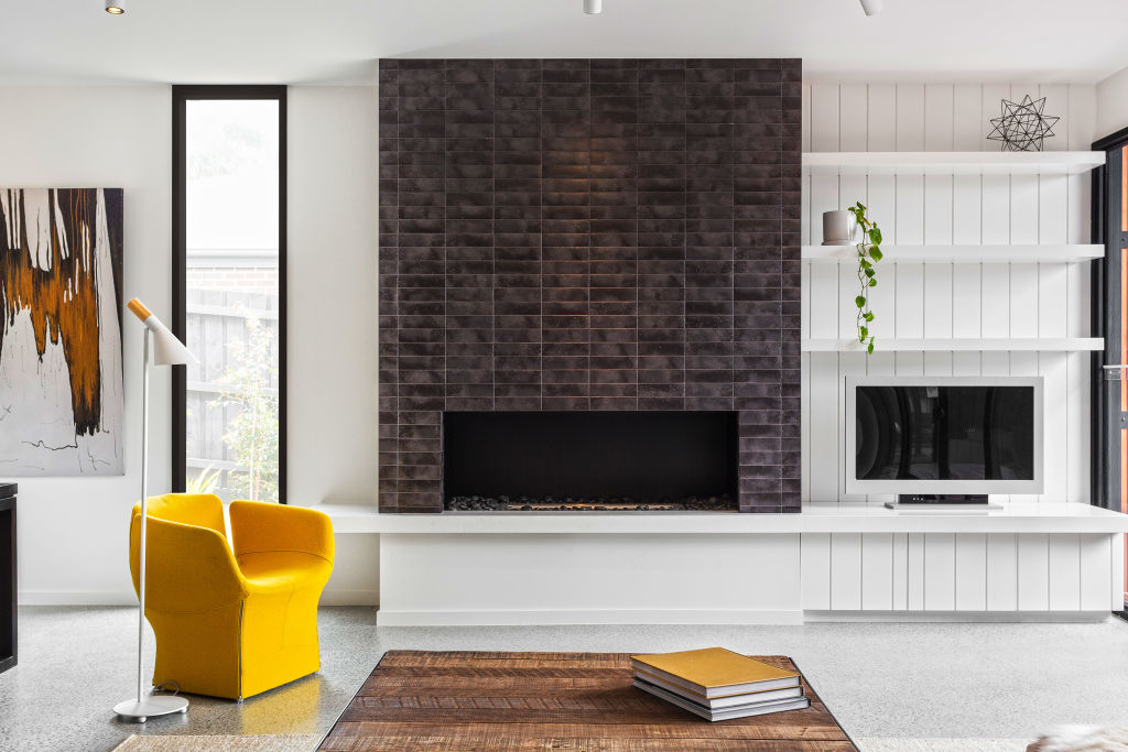
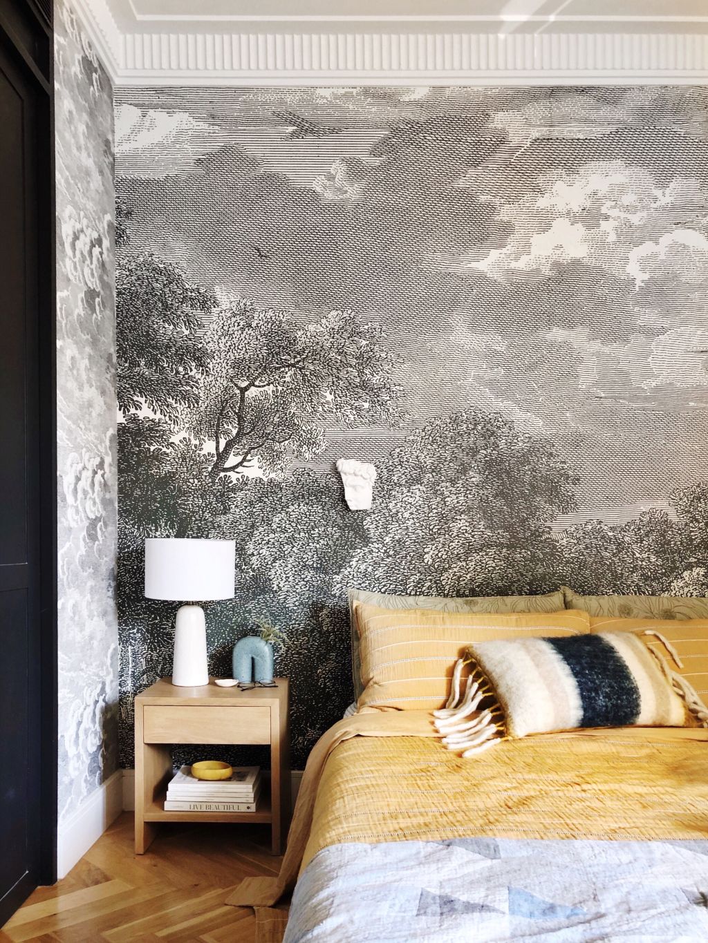
“You don’t have to use it in that bright yellow, but something that’s a bit more of a softer, buttery yellow – something that’s a bit more pastel – is a really nice way to dip your toe into using yellow in the house,” he adds.
For those of us who prefer the all-or-nothing approach, Fleming adds a word of warning: “If you do put bolder yellows all over the walls, it will bounce a lot of light and that yellow tone around the room so you are going to need some other colours in there, like blues, earthier tones and neutrals to soak up all that colour and balance it out.”
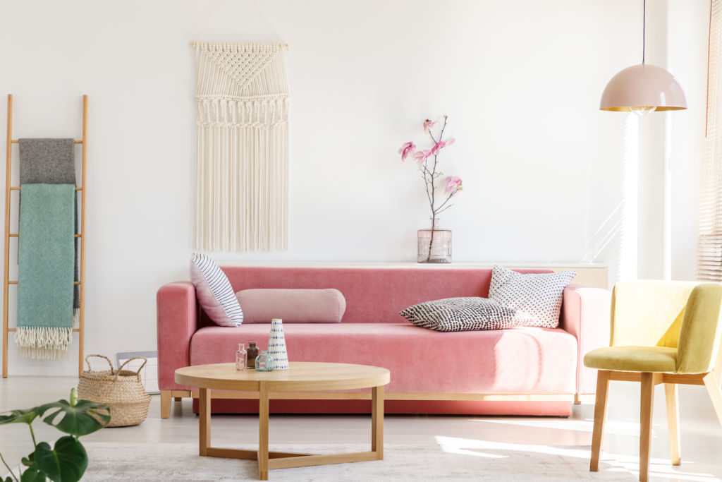
Li also suggests balancing the bright tone with lighter hues such as lilac, soft pink and pale blue to create a fresh contemporary look.
“The key is to avoid using this bold yellow with other bold colours as it can begin to look immature – we want to avoid looking like we live on the set of Playschool.”
Li says to opt for a soft buttercup yellow paired with natural beiges and browns to create a more tonal space.
“Mix soft yellow pieces like vessels and cushions with natural beige rugs, birch shelving with accents of white lighting,” she says.
Add a pop of Pantone to your home
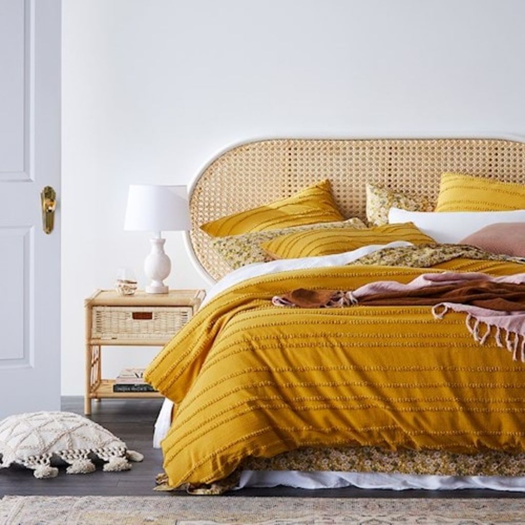
Millie mustard quilt cover from Adairs
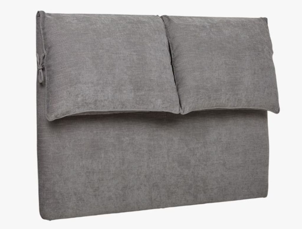
Felix slouch bedhead from GlobeWest
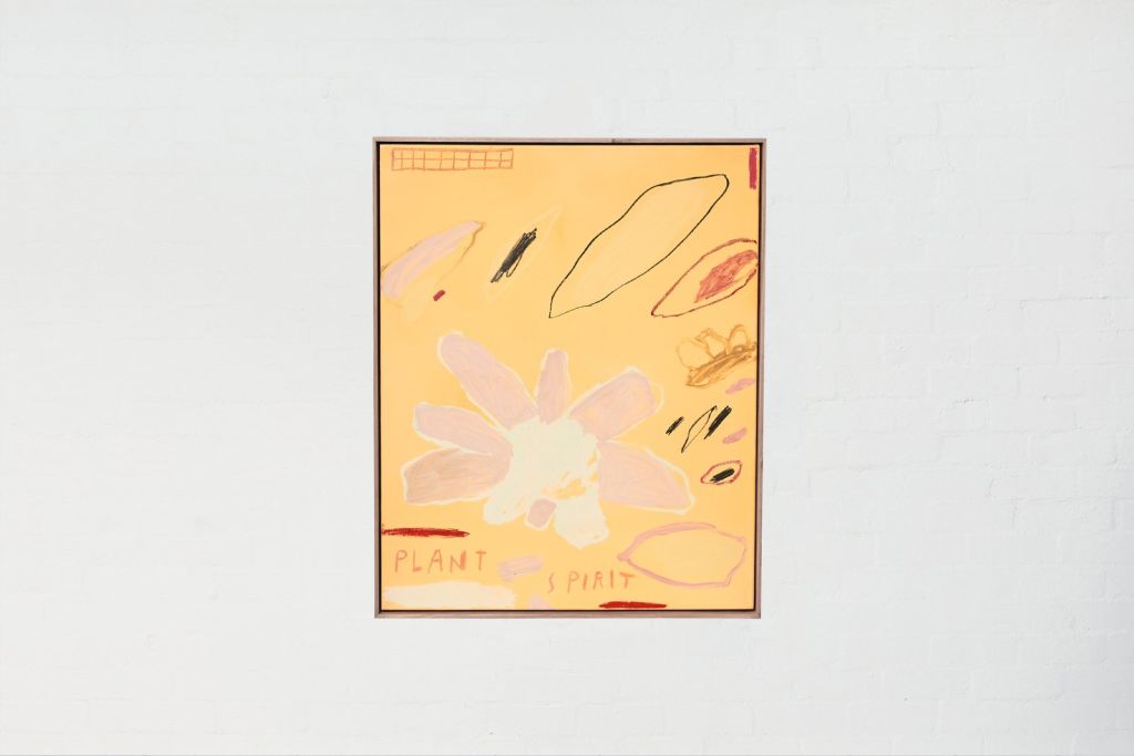
Plant spirit artwork from Jardan
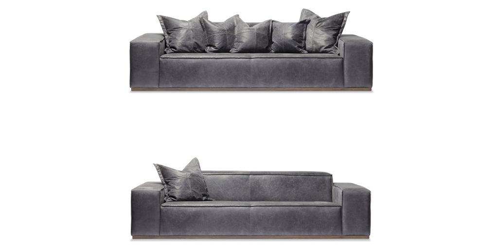
Kimon leather couch from Arthur G
Porcelain tiles from Artedomus
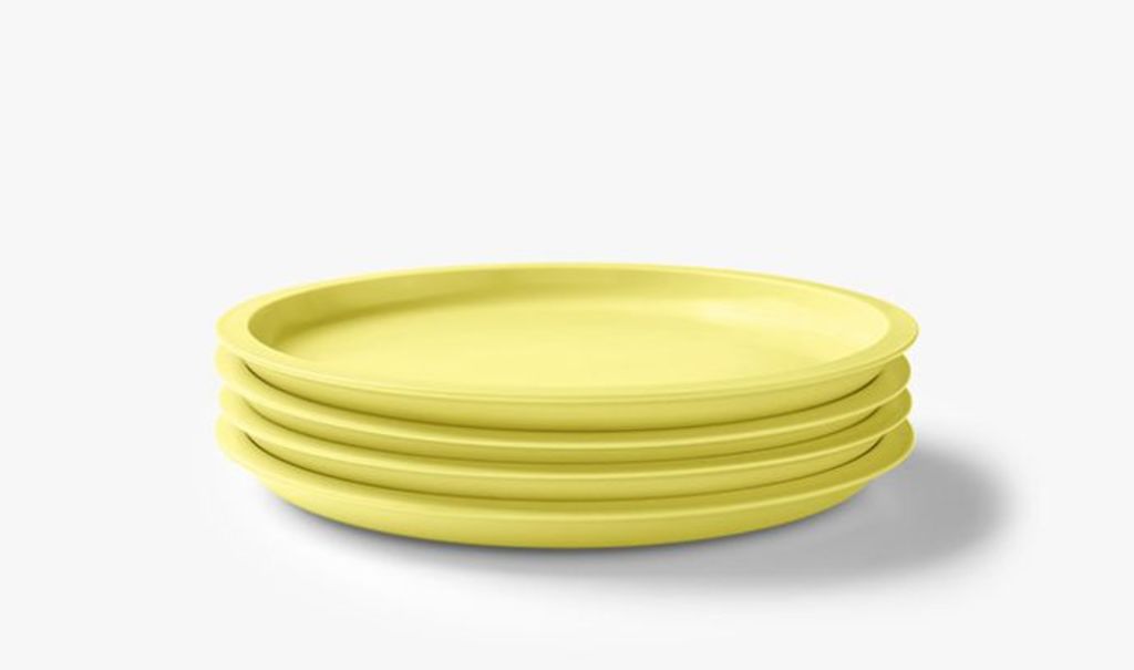
Kali side plates from Aura Home
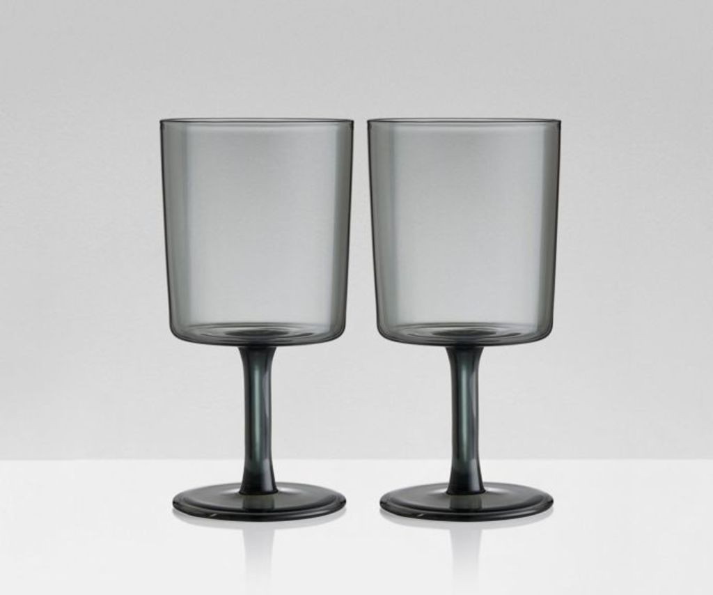
Wine glasses by Maizon Blazac via Aura Home
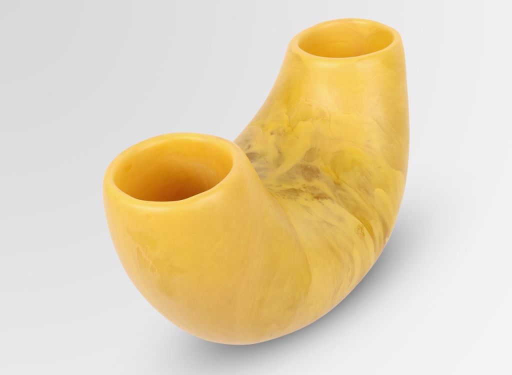
Resin horn vase by Dinosaur Designs
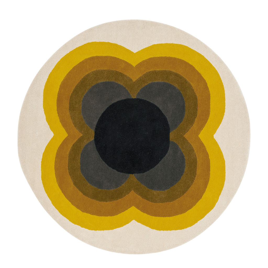
Rug from Temple and Webster
AJ cushion from Cult
Originally published by Domain