

Before & After: A Social Solution for a Slim Galley Kitchen
This redesign created the perfect petite kitchen for its owner, who loves pattern, colour and clutter-free cooking
The owner of this home in Morpeth, UK, had given up on finding a kitchen design to reflect her love of colour and order. She was also reluctant to demolish the existing – new – kitchen, even though it wasn’t working for her. When she came onboard, interior designer Cathy Dean first helped her client to rehome the old kitchen, selling cabinetry and giving appliances to charity. She then came up with the sort of characterful, well-organised space her client hadn’t imagined was possible. “She was so happy she cried when we presented the design to her,” says Dean.
Photos by Susie Lowe.
Kitchen at a Glance
Who lives here: A childcare worker
Location: Northumberland, UK
Property: A three-bedroom, one-bathroom Victorian terrace on a pedestrianised street
Size: Around 7 x 2.25 metres
Designer: Cathy Dean of Studio Dean
The client also tasked Dean with the not-insignificant issue of creating a social kitchen with loads of storage – all in a 2.25-metre-wide space. “We like a challenge!” says Dean.
Incredibly, the result is an airy yet vibrant room that packs in a hidden breakfast cupboard, two sinks, banquette seating, a table for two and more storage than the homeowner was able to fill.
The client had searched out ideas for a kitchen design that reflected her love of colour and pattern – and fulfilled her need for order and storage – but had found none… until she met Dean.
Before addressing the aesthetics of the room, meticulous planning was key, especially given the compact size of the kitchen. “It’s always spatial planning first before interior design. We don’t touch a single thing before we know it will all work,” she says.
Once appliance locations, copious storage and lots of benchtop space were factored in, Dean got to work creating a colourful yet sophisticated scheme that includes two-tone cabinetry, terrazzo flooring, colour-blocked zones, and a cosy, dark-hued lounging and dining nook that throws strong pattern into the mix.To ensure the small space didn’t feel crowded with so much going on, she integrated all appliances for a streamlined look and tempered the vibrant details with chunky white Corian benchtops, a pale ceiling and calming oak cabinetry at either end.
Studio Dean
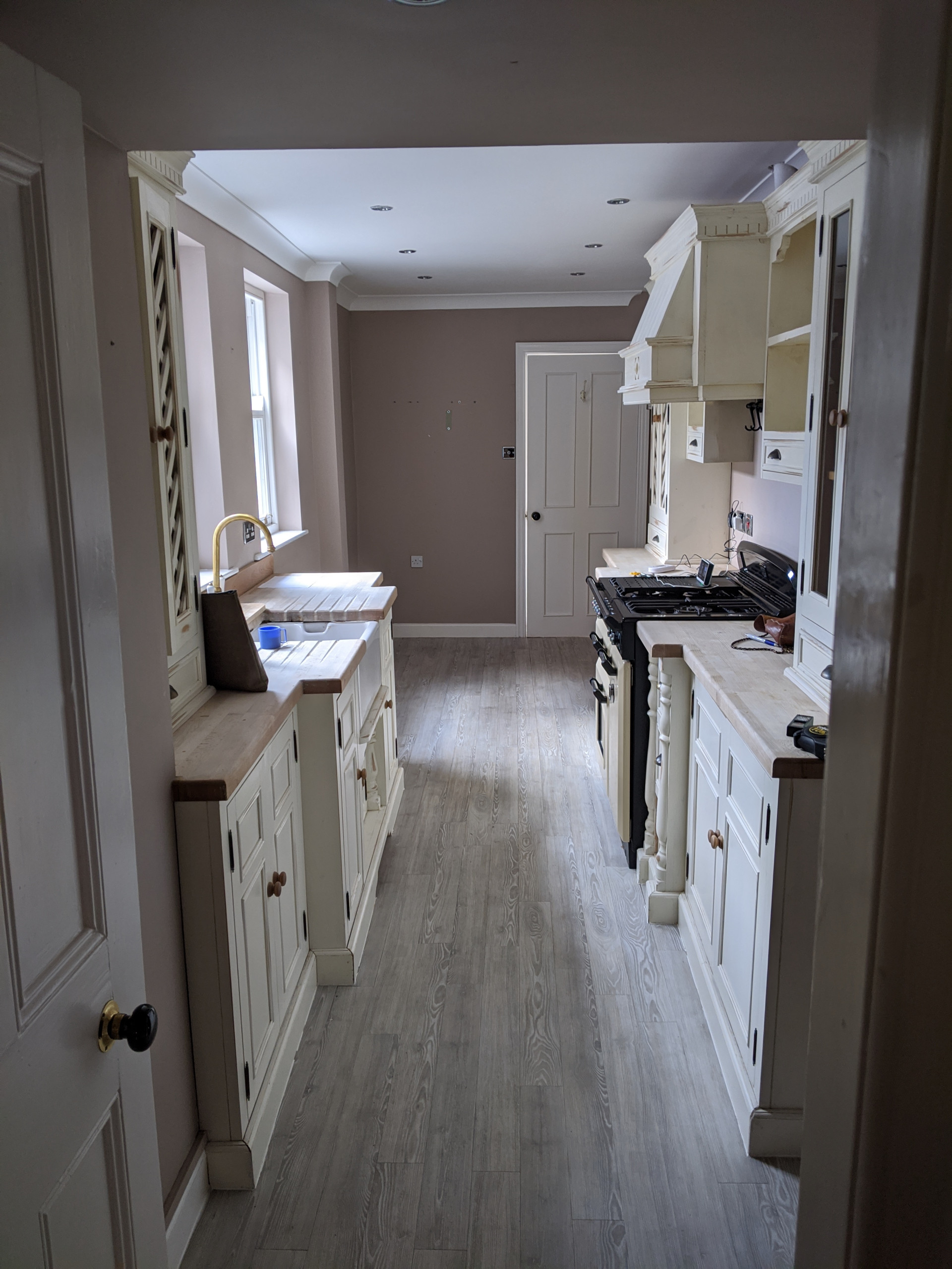
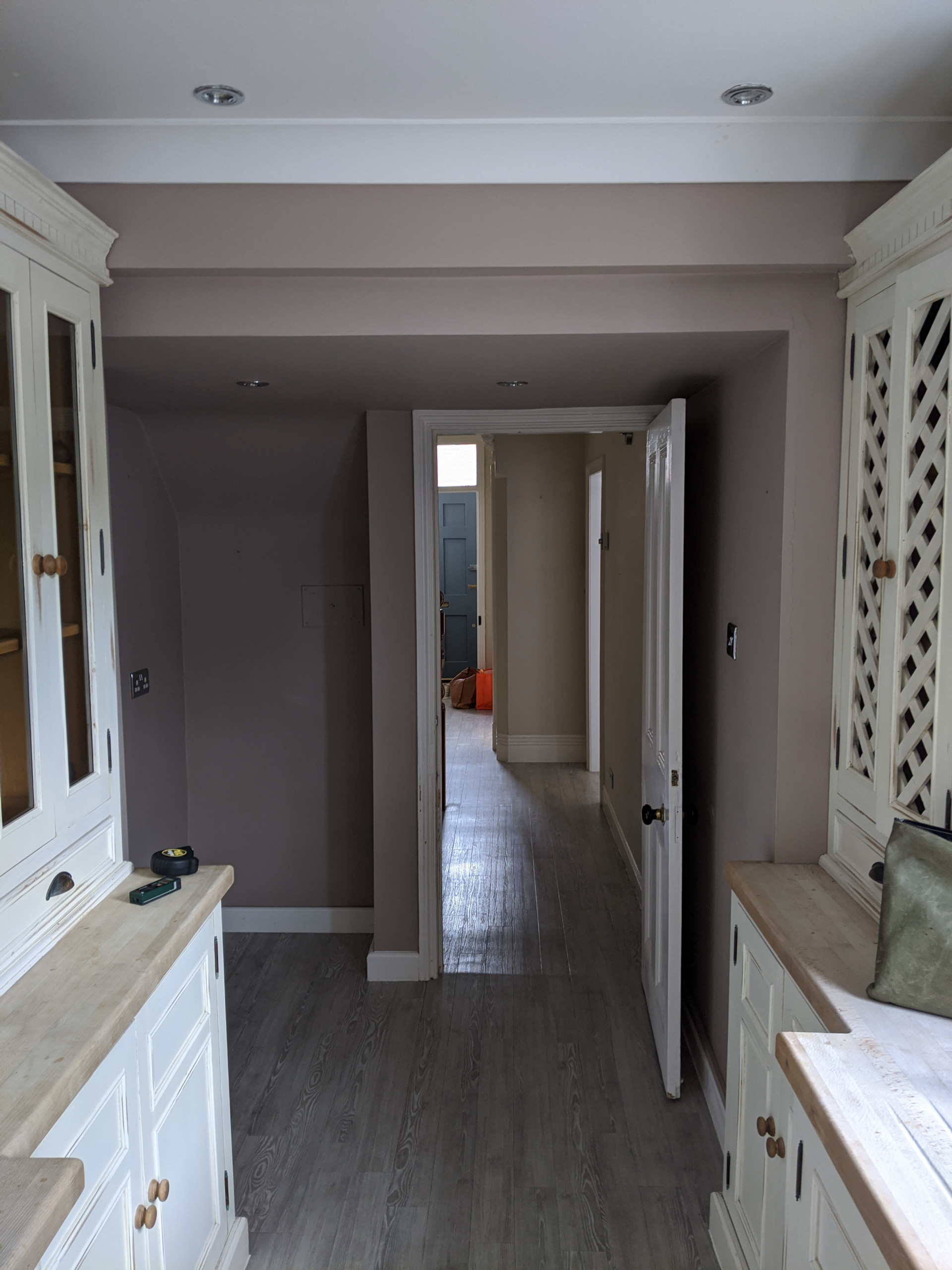
The layout and use of space in the old kitchen meant there was nowhere to sit and very little work space. “There was also very little storage,” says Dean.
Studio Dean
The owner – a keen cook – had big hopes for her little kitchen. As well as plenty of storage and benchtop space, she wanted to be able to chat to people while making drinks or cooking for them.At the outset, Dean and her client discussed extending the home with a side return that would enlarge the kitchen. “She would have lost a lot of her south-facing outside space, though, and it would have made the middle room very dark,” says Dean. The homeowner’s budget was also tight, and the designer was confident she could fulfil the brief within the existing space.Dean knew that reconfiguring the existing cabinetry units and layout would not deliver what her client wanted. It was at this point they decided to move the old kitchen on, sustainably selling and donating almost every component.
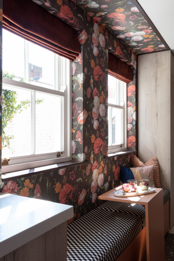
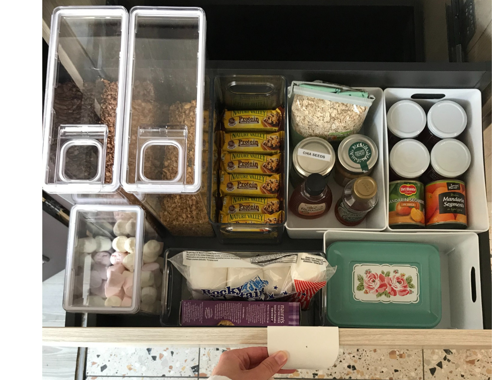
This seating area is at the heart of the layout Dean devised. The banquette seat has a small table that can easily be moved around the kitchen. “It’s on little feet, so it can slide up and down the bench,” she says. “If you want to lie down, you can push it out of the way entirely, or put it in the middle [for sharing a snack].”Beneath the bench is generous drawer storage. “The whole kitchen is drawer-tastic,” says Dean. “It’s the very best way to maximise your storage – no rummaging around in the backs of cupboards.”
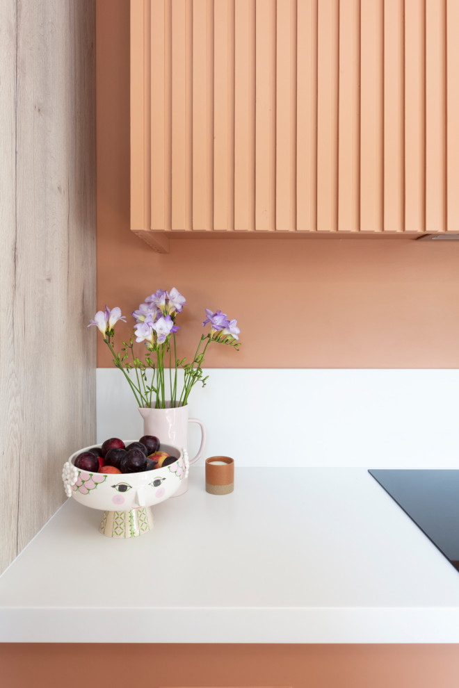
“As there are lots of other elements in the room that we wanted to sing, the worktops and splashbacks were something we wanted, basically, to be ‘silent’,” says Dean of the minimalist Corian benchtops and lower portion of the splashbacks.
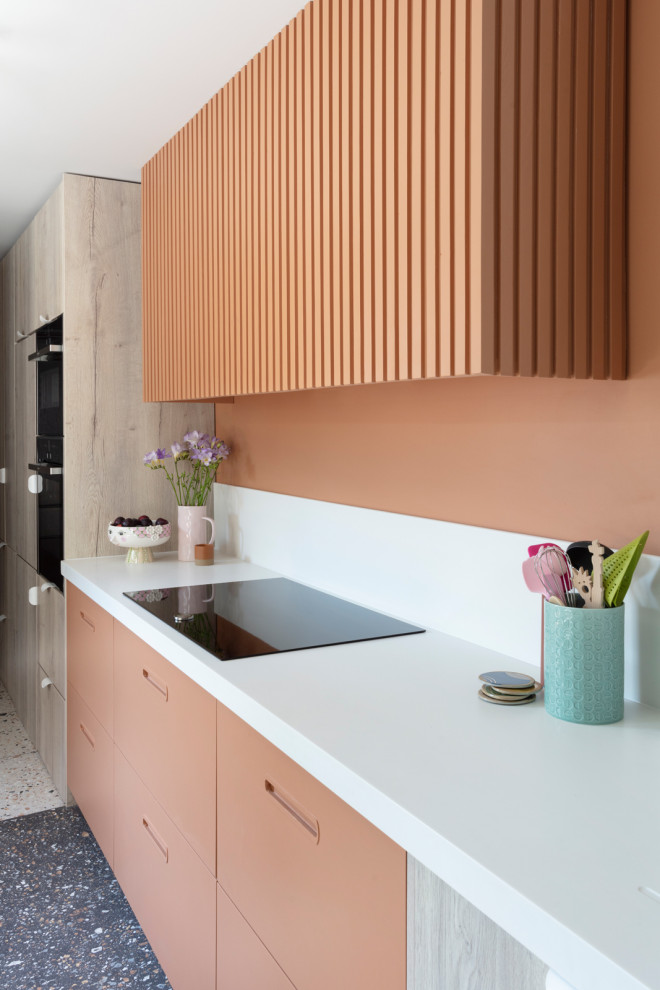
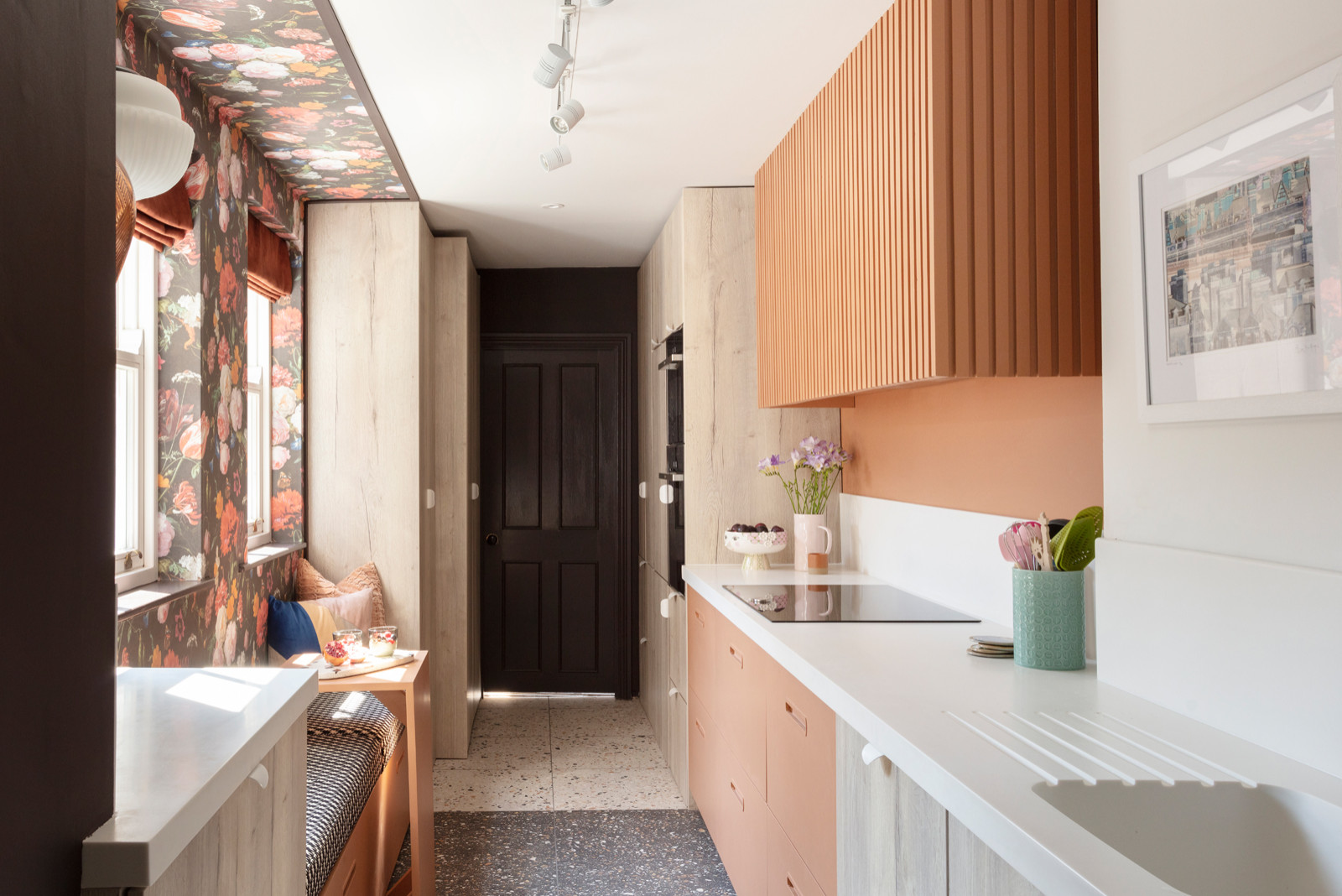
“In a galley kitchen, we avoid the ‘base cabinets with wall cabinets’ thing as it [visually] brings the walls in,” she says. As such, the only significant wall feature Dean included was this linear structure to hide the integrated Neff rangehood.
She also fitted concealed lighting underneath it to make use of the width, and to introduce task lighting and provide a cosy glow in the evenings.
The stove is an induction model. “We always try to put these in,” says Dean. “They’re slick and easy to clean.” They’re useful in small kitchens, too, as they can double up as an extra work space.
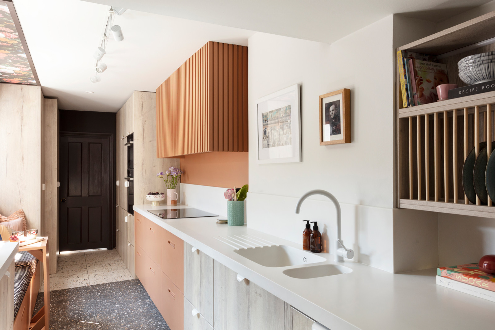
The design cuts the room into three, with oak doors at either end. “This kitchen is all about colour blocking and section blocking,” says the designer. “The cooker hood and cabinets below are the same colour and also line up vertically. The flooring also changes from light to dark terrazzo where the hood is.”
Opposite, the bench seat mirrors the division. “The apricot paint wraps around the opposite wall – it all makes you look at either side of the room rather than just down it,” says Dean. This gives the idea of more space than there is.
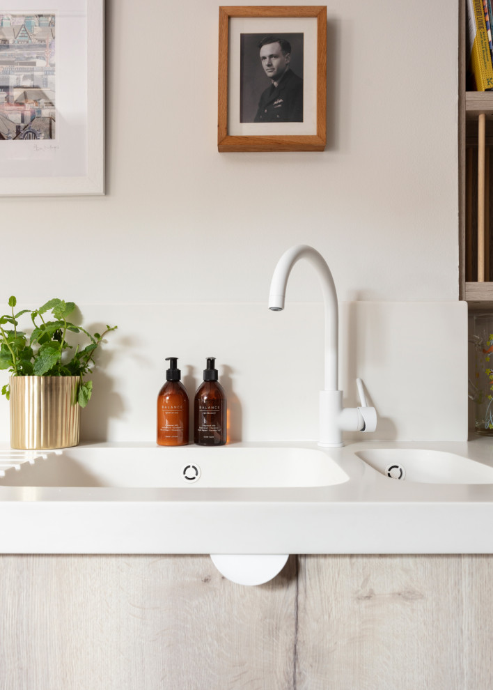
To keep things streamlined, many of the small details are white – from power points and light switches to the ceiling track lights and taps. “It’s a lovely white wall here and to suddenly have a different-coloured tap would be like having it say, ‘Hello… I’m a tap!’” says Dean.
The artwork was picked from the owner’s extensive collection and is a portrait of her dad.
Studio Dean
Previously (though it had been removed by the time this photo was taken) there was a freestanding fridge in the top left-hand corner, along with plastic storage drawers and hanging baskets.
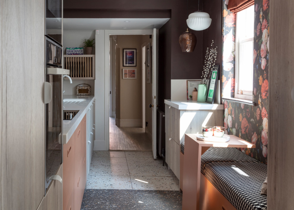
Now, the kitchen joinery runs right to the end of the room to maximise storage and bench space. The door leads to the living room and front door and, off this to the right, is a dining room.
Clearly illustrated here, the kitchen contains multiple different wall depths and awkward corners. Rather than going fully bespoke to accommodate these, Dean used standard-size cabinets where she could, and only went made-to-measure where it was absolutely necessary to make the best use of the space, which helped keep the budget down.
One of the made-to-measure areas is at the corner of the room, seen here on the left, which goes under the stairs and has two different ceiling heights.
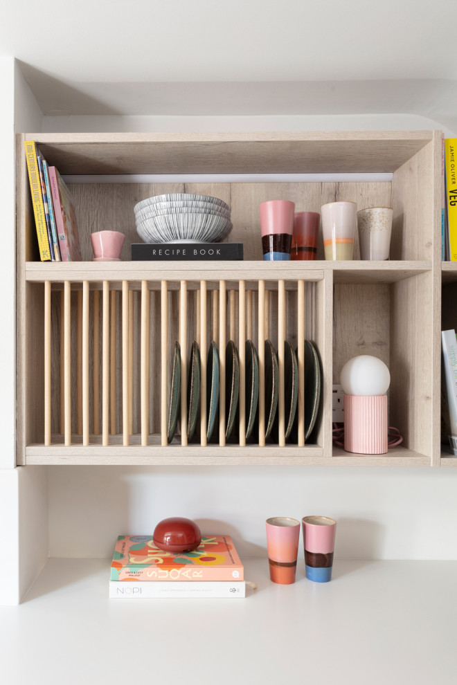
A bespoke rack that extends around the corner was a good solution. “It was a difficult space and this is where bespoke is perfect, as the measurements aren’t standard,” says Dean.
“We looked at how to make this area useful and thought it would be good for plates/serveware and recipe books. The owner has some beautiful, colourful crockery and we thought this should be on display,” she says.
Dean added a power point here to allow for more mood lighting in the form of a small lamp tucked into the end of the rack.
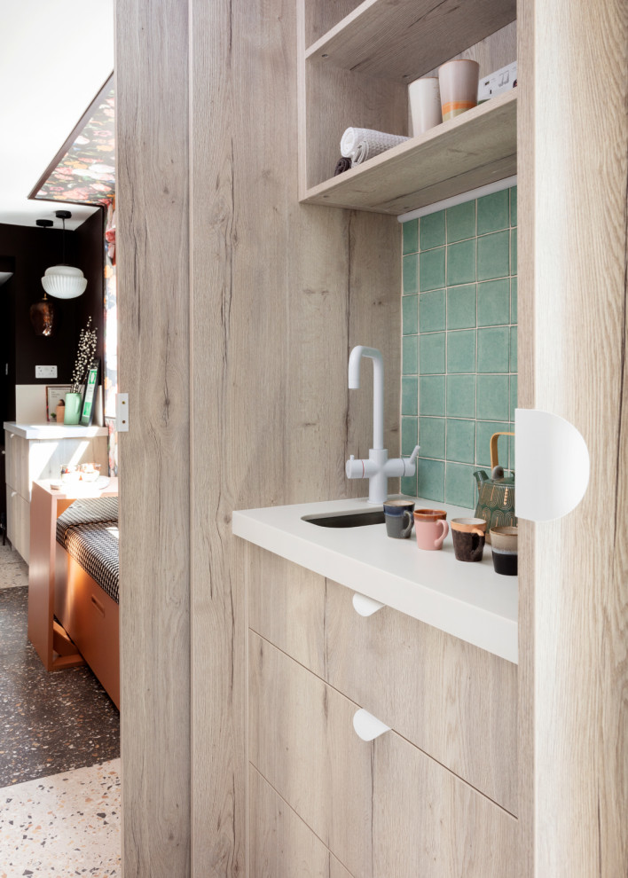
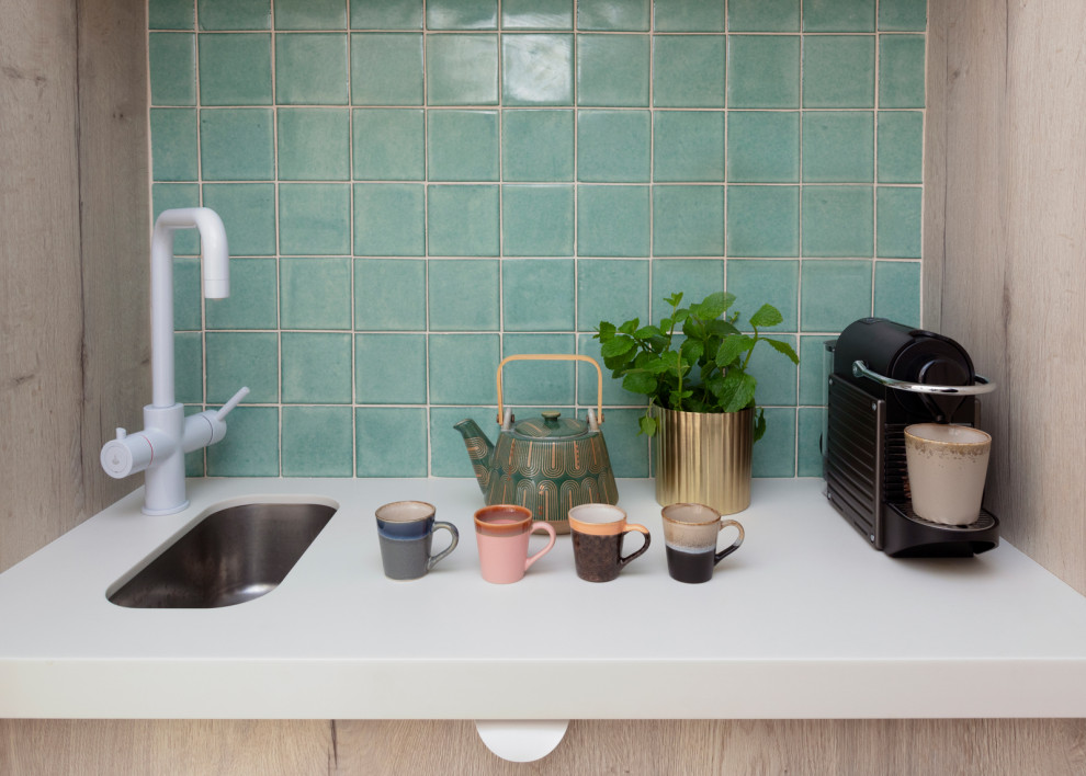
Complete with a white benchtop, tiny sink and boiling-water tap, this concealed cabinet has pocket doors to save space.
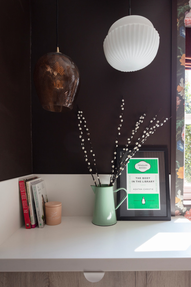
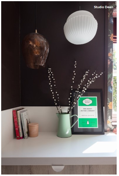
The benchtop area next to the banquette seating has decorative pendant lighting and dark walls. “This was about the idea of creating a luxurious corner in the kitchen – like a snug,” says Dean of the cosy spaces often found in UK homes.
The deep wall colour makes the solid surface recede, creating the illusion of a bigger space, while the low-hung pendants give the impression of lamp light rather than task light, keeping the feel cosy.
The owner stores her best cups and glassware in the drawers below.
 Studio Dean
A view inside one of the kitchen’s many drawers after the owner had filled them.
This is a kitchen of two halves, reflecting – Dean feels – two sides of her client’s character: vibrant and ordered. “Sometimes our clients say we seem to know them better than they know themselves,” she says with a smile.
By Kate Burt
Originally published by Houzz